TeenTix Logo
Login
Sign Up

A Feast for the Senses

​Review of the common S E N S E at Henry Art Gallery by Indigo Trigg-Hauger

Hamilton

A fully immersive experience is rare when it comes to art. More often viewers are separated by glass and velvet ropes. When one gets the opportunity to leave a trace, it invokes a visceral response. With the common S E N S E, Ann Hamilton asks viewers to go beyond viewing and achieves a highly intimate relationship between the work and the viewer. Artist Ann Hamilton has been given the unusual chance to take over the entire Henry Art Gallery. The exhibition is site-specific, created for the space using the resources the gallery and surrounding area could offer. The resulting work weaves old and new, buoyed by her collaboration with the nearby Burke Museum. The scans of dead animals from their collections have an intensely eerie quality. The garments made of animal skin and fur, laid out reverently, are practically funereal. In the brightest room downstairs, where skylights have been opened for the first time since 2001, machines approximate animal-like flapping or calls. At times it feels like a mausoleum, at others a place of worship. The choral singers wandering through add to this ambience, as do the readers sitting here and there, transcribing from a book while muttering the words to themselves. It’s odd – but also oddly calming. There are so many layers to the common S E N S E, at first it may appear impenetrable, the pieces disparate or disconnected. Allow a little time though, wander through the successive rooms, and it will give up its secrets. The lighting lends it a dream-like, surreal atmosphere. What seems random or odd at first slowly becomes clear the more you explore. Hamilton facilitates a process of finding and discovery. Though everyone starts with the same “conditions,” as she put it, each visitor excavates individually. Different senses jump out in each room; touch, sight, sound. The signs of compression and human wear on a coat. The air vents gently disturbing stacks of paper on the walls. The act of drawing aside a curtain to view an artifact. To walk through the gallery is to meditate on your own mortality and the effect of humans on their environments. As the viewer moves through the exhibition, connections reveal themselves naturally. Papers line the walls in stacks, and you are invited to read these photos and snippets of text, taking ones you connect with. By the end of the visit, you have curated your experience. In doing so though, the visitor takes away from the exhibition in a tangible way: The photos on the wall of three of the rooms will never be replaced, and the texts will ebb away to be replaced by new ones. Knowing this, there is an urge to tread lightly, to consider carefully what matters enough to take. Be prepared: the common S E N S E requires a certain level of commitment that most exhibitions do not ask of us. For some, this might feel overwhelming. The choice to participate in the exhibition is not so much a choice as a prerequisite if you want to fully engage with it. Ultimately, what makes the common S E N S E stunning is how it drives the viewer to self-examination. What you find depends on you.

the common S E N S E Henry Art Gallery October 11, 2014 - April 26, 2015

Read More

Decidedly Northwestern

​Review of Modernism in the Pacific Northwest at Seattle Art Museum by Hattie Sanders

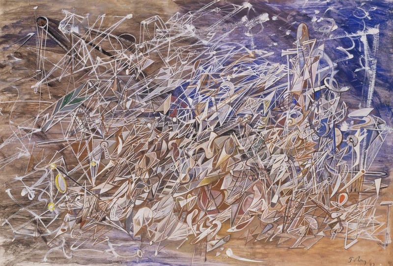
Mark Tobey Forms Follow Man

Unsurprisingly, the Seattle Art Museum does not fail to impress with their current Modernism in the Pacific Northwest exhibition.

Even with no knowledge of the title and just a few minutes in the gallery, anyone would know that this is artwork from the Pacific Northwest. There is a miraculous similarity in colors, mainly featuring darker earth tones that scream Pacific Northwestern. I was actually quite surprised at the overall completeness of the color scheme, even between artists.

Read More

Quality Art and Cool People

​Review of Teen Night Out at Seattle Art Museum by Mobird

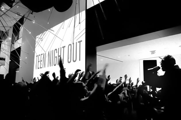
Teen Night Out

Teen Night Out is a fun, hands-on experience with the art at the Seattle Art Museum. The latest rendition, on May 2, involved a photobooth, painting, henna, a concert, a sugar bar, and a writing project.

I had fun taking pictures in the #SAMSelfie booth, including one I got for my significant other, Troy that involved a chalkboard and a fuchsia feather boa chosen from a huuuuge box of props and costumes ranging from giant sunglasses to a sailor hat. I also had a blast at the Tacocat (best band name ever, in my opinion) concert, rocked out at a failure of a dance circle, looked through all the exhibits (Hardly anyone looks through them during Teen Night Out, so definitely take advantage of this. It’s a great chance to see things up close!), laid in the Italian room, and sat and looked at one spectacular painting of a seascape for quite some time because I rarely get the chance to do that.

Read More

It May Be Hard to Distinguish What is Supposed to Be, And That’s Just Fine

​The TeenTix Press Corps' Latest Recruits Review Miró: The Experience of Seeing at Seattle Art Museum

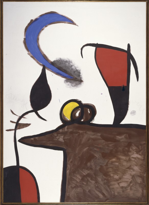
Women Bird Night As08872

“As I walked into the Miró: The Experience of Seeing at Seattle Art Museum, I noticed first off the gorgeous use of color in the artwork itself. A greeting piece that demands attention, Miró’s ‘Woman, Bird and Star’ is the essence of larger-than-life colors. The second thing I noticed was not the other art pieces, but the bright, crimson wall that stands out from its white peers. There are several atmospheric touches like this throughout the exhibition, including quotes by Miró that are printed onto the walls, as well as a room that is completely painted black. Continuing on the topic of the atmospheric setup, the lighting is absolutely spectacular. As pertaining to the sculptures, the lighting is such that you can see shadows, which creates incredible depth and a more natural viewing perspective. Almost unnoticeable, the lights trained on the paintings are centered so that the outer corners of the walls are darker than the focal point.” - Hattie S.

“One of the most fascinating parts of this exhibition is the use of color in the works. Miró's sculptures are cast from bronze and have a mystifying tint to them: a combination of blue, green, white, black, and tan. His paintings are dramatically different, consisting of vibrant blues, reds, and yellows, outlined in pure black lines. The two divergent value themes serve to play off of each other, creating a sense of harmony and balance.” - Georgia G.

Read More

Oh My Gosh…This is Entirely Made of Paper.

​Review of A World of Paper, A World of Fashion: Isabelle de Borchgrave Meets Mariano Fortuny at Bellevue Arts Museum by Ivy R.

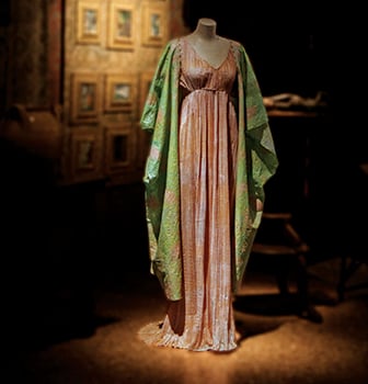
Bam Dress

In contrast to the brutal cold weather on Bellevue’s Snowflake Lane, the Bellevue Arts Museum is immediately welcoming with its warm, fresh, and modern atmosphere. On the third floor awaits your transportation into a vast new world, “A World of Paper, A World of Fashion” to be specific. The first observation of the exhibition to be taken in — simple but significant — are the colors. A wide variety of deep reds, eccentric aqua, and accenting silver and golds are present on these beautiful articles of clothing. Stepping in to view closer (if you’re fortunate enough to not have security breathing down your back) an obvious realization hits, “Oh my gosh...this is entirely made of paper.” Isabelle de Borchgrave’s intricate folds, crumples, and molds make a cohesive collection of clothes any girl would desire to try on herself. Walking through each section is like taking a visit back in time to Greek, Indonesian, Japanese, African, and Islamic cultures. One type of dress that is very prevalent throughout the exhibition is the Delphos Dress (Grecian style wear). A delicately hand-pleated dress that elegantly falls to the ground is accessorized with a thin piece of overlaying silk. Photographs of Mariano Fortuny's designs hang throughout the room, so one is able to witness an almost identical resemblance with Borchgrave’s masterpieces. Who is Fortuny you may ask? Fortuny is, in short, the backbone of Borchgrave’s inspiration in this collection. Think of him as today’s Versace, Fortuny was the leading designer of the early 20th century (Fun fact: influential women such as Natacha Rambova, aka Valentino’s wife, were known to wear his designs!). He died known as a legendary textile and clothing designer, and fortunately through Borchgrave, his remarkable works (originally made with luxury textiles such as silk, velvets, and chiffons) are brought back to life through paper. I guarantee you’ll leave BAM with at least three distinct thoughts after experiencing this exhibition: How long did it take Borchgrave to make all of that clothing? How was it transported there?! I can’t believe that was all made from paper…

So go ahead and experience a history of fashion through the blend of Borchgrave and Fortuny at Bellevue Arts Museum, and leave not only mesmerized but hopefully inspired by the art of fashion — paper or not.

Read More

Harmony and Unity

​Review of Peru: Kingdoms of the Sun and the Moon at Seattle Art Museum by Evelyn Seo

Peru

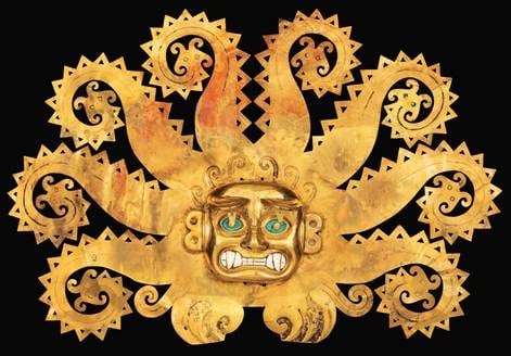
Seattle Art Museum has outdone itself once again after the Future Beauty: 30 Years of Japanese Fashion exhibition during the summer. If the past exhibition was a look out into the future, Peru: Kingdoms of the Sun and the Moon is a look back into the past. Although the artwork in this exhibition represents three thousand years of history and showcases different cultures expressed in different forms, there is one underlying theme holding everything together: harmony. According to the exhibition guide, Peru’s ancient Andean civilizations valued the unity between two opposing sides — unlike other cultures around the world, which held more significance in the differences between things. In the exhibition, the ancient civilizations’ works are excellent examples of the efforts the artisans of the past put into showing this idealistic unity. The most prominent example is perhaps the Sican culture’s ‘Double-spout vessel decorated with human figures and snake heads,’ which melds two spouts into one vessel with delicate patterns and miniature statues. The most interesting point about this piece is the simplicity that prevails over the intricate and complex patterns. As I observed the piece, I was at first only able to pay attention to the details of the vessel, such as the shape of the holes. But when I took a step back and just looked, the patterns gathered together to form one simple, unified display. And the beauty of its simplicity simply overwhelmed me. As anyone would notice if they walked around the exhibit, a significant amount of the pieces on display are made out of flashy materials such as gold or silver. But it never seem like too much. Why is that? The “Frontal ornament with feline head and octopus tentacles ending in catfish heads,” otherwise known as Peru’s “Mona Lisa,” embodies the reason these pieces do not seem extravagant. Just like Mona Lisa’s ethereal smile, the ornament captures its audience through its geometric unity by the usage of decalcomania. The two sides are so identical with each other to the point that it’s as if the artist simply made one side of the ornament and copied it over — copy and paste, copy and paste. The appreciation of harmony seems to have been carried into the more modern day Peru. For example, the sculpture named “Virgin of the Fifth Seal” made in the 18th century showcases the balance between Spanish and Peru's native cultures. Although the Peruvian artist sculpts Virgin Mary, her appearance is unlike the ones from Europe. Other images of Virgin Mary were always with her in soft, light colors to represent her purity and ultimate good. But this piece chose to show the harmony between both good and evil; she is seen with both light and dark colors on and has fair skin with dark hair. This whole exhibit was an eye-opener for me. After the exhibition, I discovered a whole new world of unity in our own culture. For those who haven’t visited the exhibit, I would highly recommend it. Who knows? You might just figure out what all those gurus’ talk about yin and yang is really all about.

Peru: Kingdoms of the Sun and the Moon Seattle Art Museum Through January 5, 2014

Read More

Putting Together the Puzzles of Abstract Northwest Native Art

​Review of Robert Davidson: Abstract Impulse at Seattle Art Museum by Emma Lee

In case you hadn’t guessed from the title, Robert Davidson’s current exhibition, Abstract Impulse, at the Seattle Art Museum is, well, abstract. And it’s apparently impulsive in its confusion of titles, captions, loud colors, and shapeless forms. I walked out of the exhibition baffled.

Robert Davidson began the Northwest Coast Native art revival in 1969, when he created the first totem pole to stand in his ancestral village, Masset, since the 1880s. He has studied the artistic style of his tribe, the Haida, for years, and the exhibit holds a collection of 45 sculptures, prints, jewelry, and paintings by the artist, all based on the traditions of Northwest Native art.

Read More

Frames

Laura V. contemplates all the kinds of beauty that there are at Out [o] Fashion Photography at Henry Art Gallery
Outo1

Beauty through fashion photography is the focus of the Henry Art Gallery's new exhibit, Out [o] Fashion Photography: Embracing Beauty. Out [o] focuses on the many nuances of beauty using studio, fashion, and pop culture photography by artists from the 19th to 21st century.

I had the opportunity to walk through the gallery with curator Deborah Willis and a small group. The fluid and open gallery perfectly frames each photograph, which are juxtaposed with multimedia further enhancing the subtleties of Willis' ideas about media, and how different forms of beauty interconnect with each other.

Read More

Login

Create an account | Reset your password