Icons and Ideals: Celebrating the Life and Legacy of Keith Haring
Review of Keith Haring: A Radiant Legacy at the Museum of Pop Culture
Written by TeenTix Newsroom Writer AICHA SINHA-KHAN and edited by Teen Editorial Staff member SYLVIE JARMAN

Whether you know it or not, you’ve certainly seen Keith Haring’s art. From being plastered on the subways of New York in the ‘80s to the classic motifs of his featured on brands like Converse and Uniqlo today, it’s no doubt that Haring is a household name, despite the tragic brevity of his career; Haring unfortunately passed away at 30 from complications due to AIDS, only 10 years into his career. The Museum of Pop Culture recently presented a special exhibition called Keith Haring: A Radiant Legacy, with over 240 pieces of his artwork on display, as well as selections from Haring’s personal art collection and work from his close friend and inspiration Angel Ortiz. The exhibit is a thorough, comprehensive overview of the artist’s life, if sometimes improperly structured.
The first room acts as a landing depot, transporting you straight into the ‘80s. Cyndi Lauper plays as you walk around the first room and read about Haring in his childhood, early career and life as an art student. Haring’s work is famously recognized for its iconic lexicons, so it’s no surprise that the exhibits start with the early forms of his classic figures, such as his Smiling Face, an iconic early piece which appears in many iterations throughout the gallery. The first room provides context needed to appreciate the rest of his featured work, and elaborates on his signature styles through the three sections of the gallery.

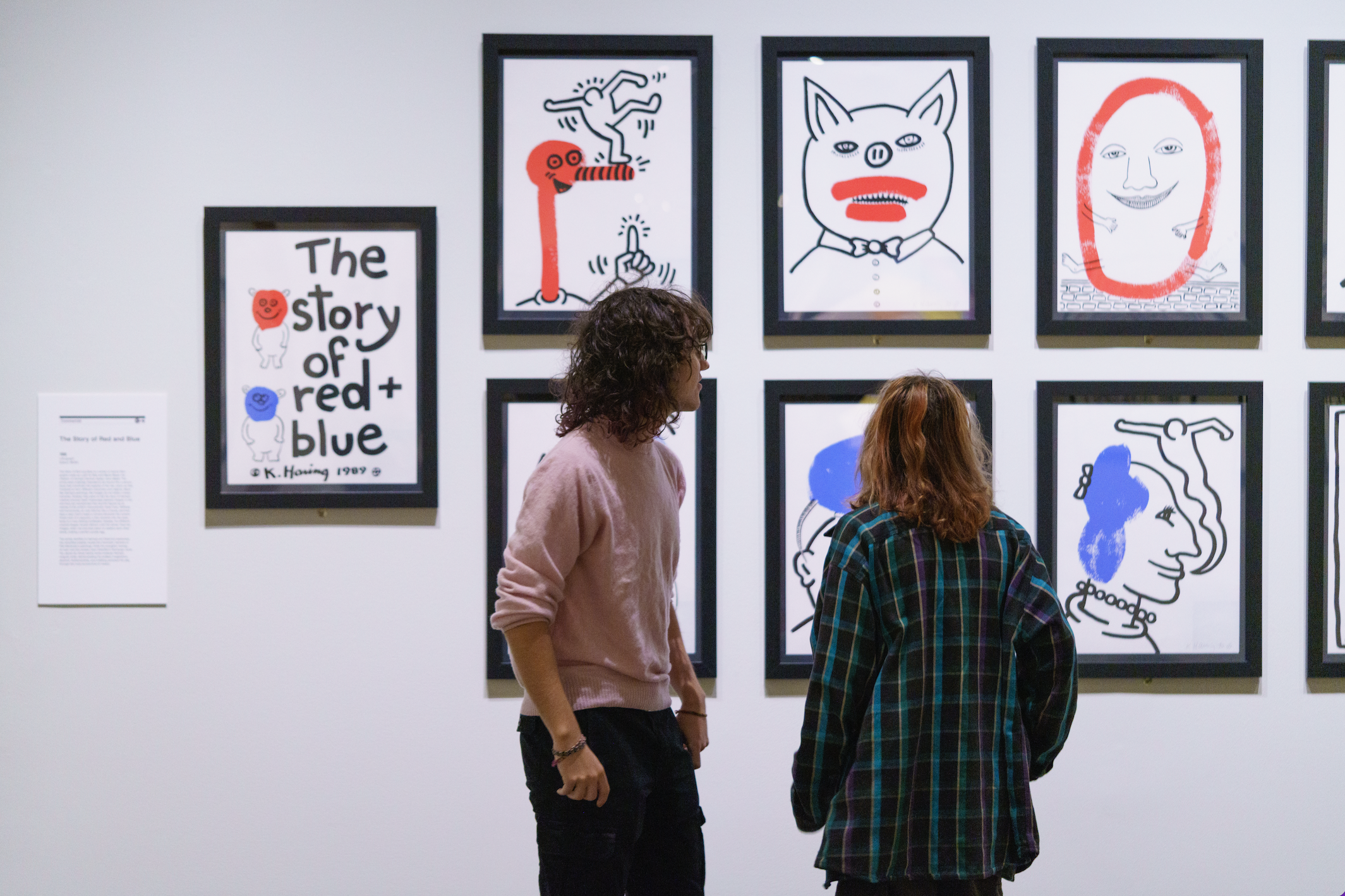
The centermost collection is entitled The Story of Red and Blue, a collection of over 20 works. Each print alternates between drawings of red and blue characters and motifs in thick, simple lines. The colors begin to mix more and more until the very last image is a mauve elliptical blob that’s cradled in an outstretched palm. It’s classic Haring — ‘simple’ thick lined drawings accentuated with strokes of color in the right places that make it pop, and the exhibit does a good job of centering this piece to viewers. Similar ‘commercial’ pieces are seen if you take the rightmost passage from here — a poster of Brooke Shields accompanied by illustrated stick figures is popular, and so are various advertisements for different companies. These exhibits are loosely arranged chronologically, so the audience is privy to how Haring’s style expands, becoming even more vivid and technically proficient as he rose to cultural relevance amidst the ‘80s street art scene.
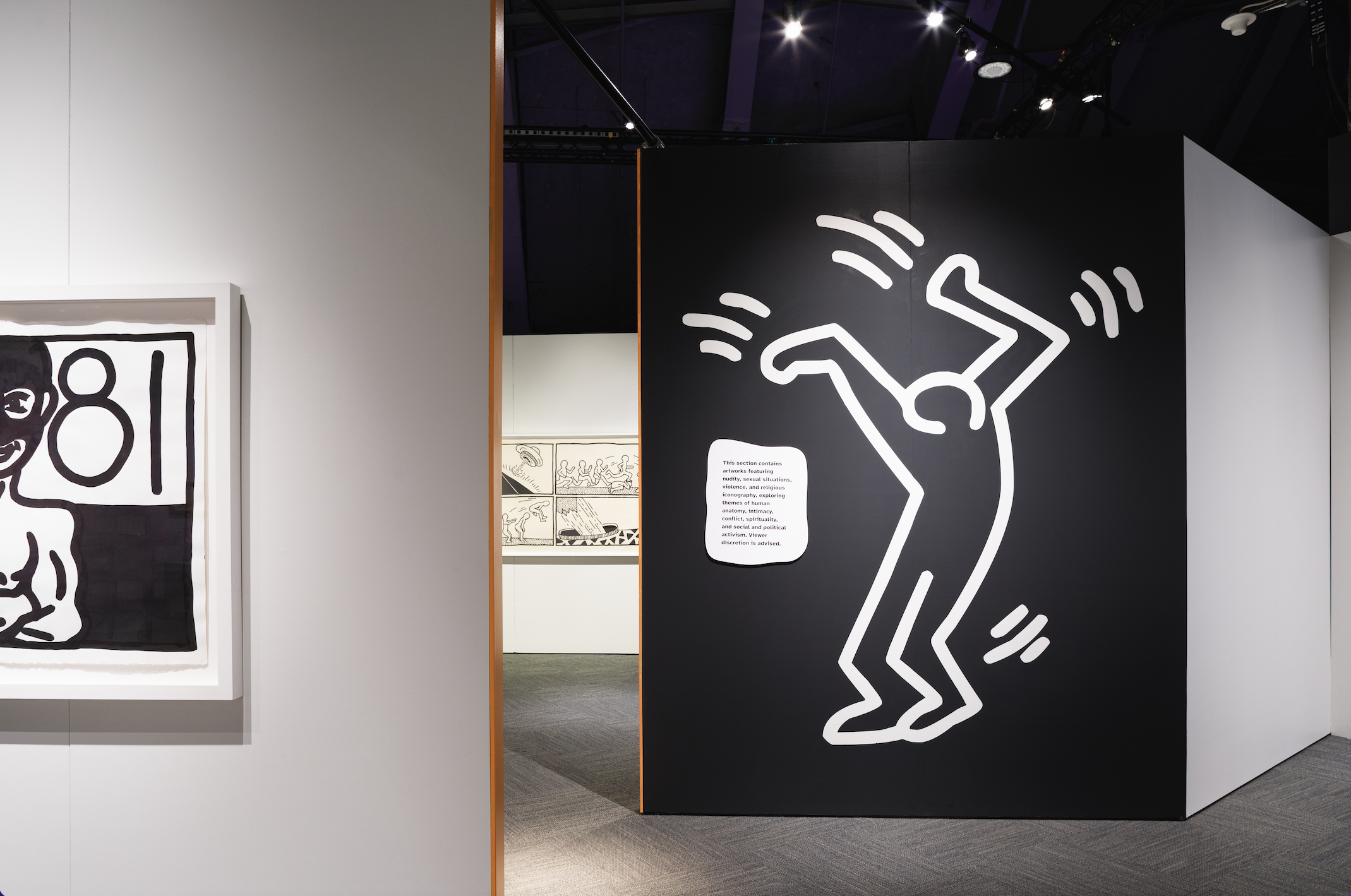
However, not all of Haring’s work is as public or popular. The leftmost room is where the viewer sees part of Haring that is not often seen in his art. Feelings of loneliness and introspection hang heavy throughout this room with several untitled works, one depicting a figure nailed to a cross while dogs marked with small dashes appear to be barking at them. This is a symbol Haring typically uses to mark an individual as diseased, or ‘other’, but here it is isolating the persecuted figure, calling out a sickness in the masses as they shout abuse at the person.That sense of seclusion is apparent throughout this room, most notably featured in the six-piece series Bad Boys. These are images skillfully depicting explicit male homosexuality, with the museum description noting “Haring took pains to only depict sexual subjects matter in works destined for private consumption, never in public commissions or street art.” It’s significant that the exhibit includes these, providing a space for Haring’s thoughts on uniquely personal ideas and issues. Haring was a gay man, and its significance in his artwork is clearly illustrated in this section. Although the six images are lively and show Haring’s typical style, they too have a place in this room, where Haring’s deeper thoughts and unlabeled musings can be seen for viewers to understand the man behind the art.

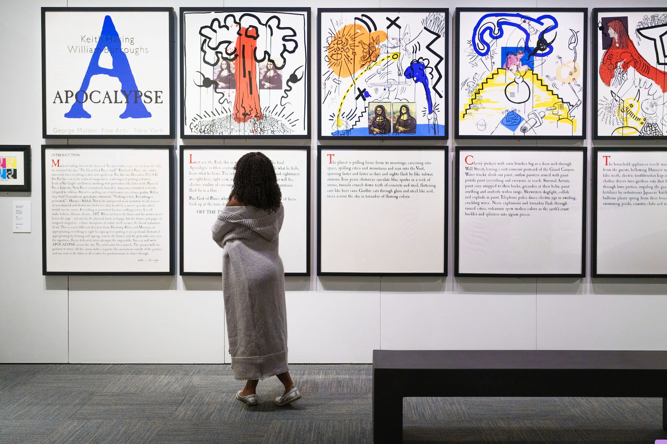
However, the exhibit can feel cluttered at points. There are a number of sequential wings that further Haring’s story: his final works before he died, a room dedicated to the pop-up art shop he had set up, and an entire section devoted to his remembrance and legacy. Along the way, it seems the museum runs out of room and has to double up pieces, like with Apocalypse, a beautiful smorgasboard of color, catastrophic imagery and a broken story, courtesy of collaborator William Burroughs. The piece takes up the entire right-side wall in the room, and invites the most viewers throughout the exhibit, yet work flanking Apocalypse doesn’t match the mood of the piece or work with the placement. The most jarring instance is the juxtaposition between Apocalypse and selections from The Valley, another Burroughs contribution. The Valley is a more delicate collection, with thin-lined etches that depict darker, more detailed imagery than Haring’s work. However, placing them next to Apocalypse effectively relegates smaller collections to the duty of poorly placed palate-cleansers. This pattern is mostly before the end of the exhibition; some selections share walls in ways that aren’t entirely meaningful, with either pieces from different years, or pieces that don't mesh together.
This issue is resolved by the end, though, where the exhibit centers on Haring’s life and legacy. The gallery up until that point has walked you through Haring’s life as an artist, but from here, it endeavors to bring forth the lens through which others had perceived him. This includes old yearbook photos, magazine shoots, and selected pieces from friend Angel Ortiz, once a teenager with whom Haring worked, and who has since been influenced by Haring’s work. There’s more too, with the final walkway out to the exit featuring all of Haring’s social justice work: his demands to free South Africa, as well as his work on the awareness of AIDs. The exhibit ends with small sketches that Haring created in collaboration with Sean Kalish, a child who would frequent his pop shop. By concluding the exhibit here, it ends with a swell of hope; like Haring passed on the mantle for the youth to continue.

Overall, the exhibit does a beautiful job carrying the viewer through Haring’s legacy, if not for the portions where the journey takes a few sharp turns. However, the amount of work that the exhibition endeavors to condense is no easy feat, and they do an admirable job in their execution, making the exhibit worth seeing for both die-hard fans of Haring as well as newer ones looking to get better acquainted with his work.
Lead photo courtesy of MoPOP
The TeenTix Newsroom is a group of teen writers led by the Teen Editorial Staff. For each review, Newsroom writers work individually with a teen editor to polish their writing for publication. The Teen Editorial Staff is made up of 6 teens who curate the review portion of the TeenTix blog. More information about the Teen Editorial Staff can be found HERE.
The TeenTix Press Corps promotes critical thinking, communication, and information literacy through criticism and journalism practice for teens. For more information about the Press Corps program see HERE.

